Categorical Data Analysis with vcd Package
- Treatment helpful for Arthritis patients?
(Bee's revision summary note, completed 7 March 2017)
This analysis is done using R, vcd package (for the analysis) and knitr package(for the html compilation).
The motivation for this summary note is for my revision of Categorical Data Analysis, using the following reference book.
My study revision here is done following the above mentioned book, with some additional study notes added for my own reference.
For more comprehensive explanation, do refer to the book instead. The book is available on Amazon.
The goal of the analysis in this summary is to understand whether Treatment has any effect on the Improvement Status of Arthritis patients .
1) Input Dataset
The data for this analysis is the Arthritis dataset that is included in the vcd package.
The dataset consists of a data frame with 84 observations and 5 variables.
- ID patient ID.
- Treatment factor indicating treatment (Placebo, Treated).
- Sex factor indicating sex (Female, Male).
- Age age of patient.
- Improved ordered factor indicating treatment outcome (None, Some, Marked).
Note:
Placebo is a substance having no pharmacological effect but administered as a control in experimental or clinical testing.
Thus, in this dataset context, Placebo refers to no treatment.
library(vcd, quietly=TRUE)
## Warning: package 'vcd' was built under R version 3.2.5
str(Arthritis)
## 'data.frame':	84 obs. of  5 variables:
##  $ ID       : int  57 46 77 17 36 23 75 39 33 55 ...
##  $ Treatment: Factor w/ 2 levels "Placebo","Treated": 2 2 2 2 2 2 2 2 2 2 ...
##  $ Sex      : Factor w/ 2 levels "Female","Male": 2 2 2 2 2 2 2 2 2 2 ...
##  $ Age      : int  27 29 30 32 46 58 59 59 63 63 ...
##  $ Improved : Ord.factor w/ 3 levels "None"<"Some"<..: 2 1 1 3 3 3 1 3 1 1 ...
summary(Arthritis)
##        ID          Treatment      Sex          Age          Improved
##  Min.   : 1.00   Placebo:43   Female:59   Min.   :23.00   None  :42
##  1st Qu.:21.75   Treated:41   Male  :25   1st Qu.:46.00   Some  :14
##  Median :42.50                            Median :57.00   Marked:28
##  Mean   :42.50                            Mean   :53.36
##  3rd Qu.:63.25                            3rd Qu.:63.00
##  Max.   :84.00                            Max.   :74.00
2) Simple Cross Tabulation for Treatment Type and Improvement Status
counts <- table(Arthritis$Improved, Arthritis$Treatment)
counts
##
##          Placebo Treated
##   None        29      13
##   Some         7       7
##   Marked       7      21
3) Plots
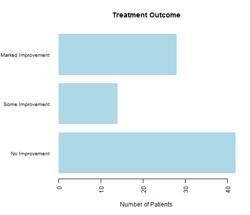
3.1 Simple Bar Plots
par(mar=c(5,8,4,2))
par(las=2)
countImprove <-table(Arthritis$Improved)
barplot(countImprove,
        main="Treatment Outcome",
        col="lightblue",
        horiz=TRUE,
        border=NA,
        cex.names=0.8,
        xlab="Number of Patients",
        names.arg=c("No Improvement", "Some Improvement", "Marked Improvement"))

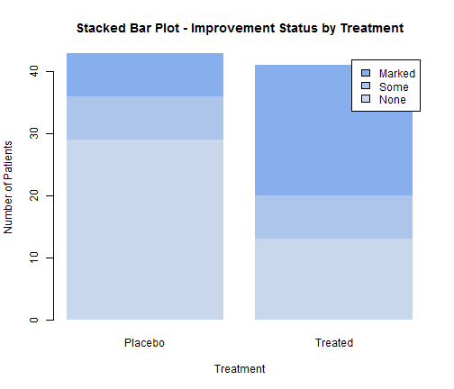
3.2 Stacked Bar Plots
barplot(counts,
        main="Stacked Bar Plot - Improvement Status by Treatment",
        col=c("#c9d7ed","#adc5ea","#87afed"),
        xlab="Treatment",
        ylab="Number of Patients",
        border=NA,
        legend=rownames(counts))

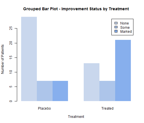
3.2 Grouped Bar Plots
barplot(counts,
        main="Grouped Bar Plot - Improvement Status by Treatment",
        col=c("#c9d7ed","#adc5ea","#87afed"),
        xlab="Treatment",
        ylab="Number of Patients",
        border=NA,
        legend=rownames(counts),
        beside=TRUE)

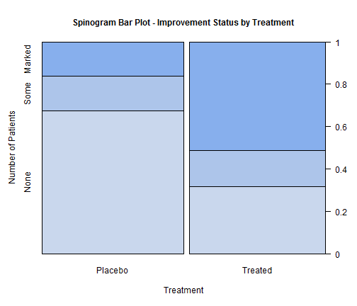
3.3 Spinograms Bar Plots
counts_transpose <- table(Arthritis$Treatment, Arthritis$Improved)
spine(counts_transpose,
      gp=gpar(fill=c("#c9d7ed","#adc5ea","#87afed")),
      main="Spinogram Bar Plot - Improvement Status by Treatment",
      xlab="Treatment",
      ylab="Number of Patients")

Note: Have not really figure out how to specify no border for Spinograms chart.
Self Reminder: Need to learn Adobe Illustrator to supplement the R charts presentation.
4. Test of Independence
4.1 Chi Square Test
a. Treatment vs Improvement
The Chi-square Test is testing the null hypothesis that the two samples are independent.
mytable <- xtabs(~Treatment+Improved, data=Arthritis)
mytable
##          Improved
## Treatment None Some Marked
##   Placebo   29    7      7
##   Treated   13    7     21
chisq.test(mytable)
##
## 	Pearson's Chi-squared test
##
## data:  mytable
## X-squared = 13.055, df = 2, p-value = 0.001463
In this case, the p value is less 0.05. Thus, we reject the null hypothesis, and conclude that there appears to be a significance relationship between the treatment received and the level of improvement.
b. Gender vs Improvement
mytable2 <- xtabs(~Sex+Improved, data=Arthritis)
mytable2
##         Improved
## Sex      None Some Marked
##   Female   25   12     22
##   Male     17    2      6
chisq.test(mytable2)
## Warning in chisq.test(mytable2): Chi-squared approximation may be incorrect
##
## 	Pearson's Chi-squared test
##
## data:  mytable2
## X-squared = 4.8407, df = 2, p-value = 0.08889
In this case, the p value is more than 0.05. Thus, we do not reject the null hypothesis, and conclude that there is no significance relationship between the gender of the patient and the level of improvement.
Explanation for "## Warning in chisq.test(mytable2): Chi-squared approximation may be incorrect" :
The warning is because one of the six cells has an expected value less than 5, which may invalid Chi-Square Test. For cases with small counts, the alternative would be to use Fisher's exact test. In general, when expected value is lower than 5, assumptions for Pearson's chi-squared test may be broken.
4.2 Fisher's Exact Test
mytable <- xtabs(~Treatment+Improved, data=Arthritis)
mytable
##          Improved
## Treatment None Some Marked
##   Placebo   29    7      7
##   Treated   13    7     21
fisher.test(mytable)
##
## 	Fisher's Exact Test for Count Data
##
## data:  mytable
## p-value = 0.001393
## alternative hypothesis: two.sided
Thus, based on the p-value(<0.05), we reject the null hypothesis, and conclude that there appears to be a significance relationship between the treatment received and the level of improvement.
4.3 Cochran-Mantel-Haenszel Test
The test here is different from the above test; another factor is included to test the independence of the two variables, within each strata group for Gender.
mytable3 <- xtabs(~Treatment+Improved+Sex, data=Arthritis)
mytable3
## , , Sex = Female
##
##          Improved
## Treatment None Some Marked
##   Placebo   19    7      6
##   Treated    6    5     16
##
## , , Sex = Male
##
##          Improved
## Treatment None Some Marked
##   Placebo   10    0      1
##   Treated    7    2      5
mantelhaen.test(mytable3)
##
## 	Cochran-Mantel-Haenszel test
##
## data:  mytable3
## Cochran-Mantel-Haenszel M^2 = 14.632, df = 2, p-value = 0.0006647
Thus, based on the p-value(<0.05), we reject the null hypothesis and conclude that there is a significance relationship between the treatment received and improvement, within each controlled gender group.
5. Measure of Association
Once we established that there is a significance relationship, the next step is to measure the association.mytable <- xtabs(~Treatment+Improved, data=Arthritis) mytable
##          Improved
## Treatment None Some Marked
##   Placebo   29    7      7
##   Treated   13    7     21
assocstats(mytable)
##                     X^2 df  P(> X^2)
## Likelihood Ratio 13.530  2 0.0011536
## Pearson          13.055  2 0.0014626
##
## Phi-Coefficient   : NA
## Contingency Coeff.: 0.367
## Cramer's V        : 0.394
1. Cramér's V (sometimes referred to as Cramér's phi and denoted as φc) is a measure of association between two nominal variables. The value of Cramér's V is between 0 and +1 (inclusive). In general, the larger magnitude for Cramer's V indicate stronger associations.
2. Similar to Cramer's V, the Contingency Coefficient is also a measure of association and the larger the coefficient the stronger the association, with values ranging from 0 (no association) to +1 (perfect association).
3. Why "Phi-Coefficient:NA"? It is because this Phi-Coefficient is only defined for 2 × 2 contingency table.
6. Plot to Visualise Association
Using Mosaic plot to visualise the relationship between the the variables tested above.
mosaic(~Treatment+Improved, data=Arthritis, main= "Basic Mosaic for Improvement vs Treatment", shade=TRUE, gp_args = list(interpolate = c(1, 1.8)), legend=TRUE)

This extended mosaic plot add color and shading to represent the residuals from a fitted model.
The blue shading indicates cross-classifications that occur more often than expected, assuming that Improvement and Treatment is unrelated.
Whereas, the red shading indicates cross-classifications that occur less often than expected under the null model (independence).
From the visual check, it can be observed that there is more observations in the cell for "Treated" and "Marked" improvement (blue), than would be expected under the null model.
@The end.